


The Best Google Fonts for Professional Websites in 2026
By Josh Ternyak

April 22, 2026
Google Fonts has thousands of typefaces — and most of them are wrong for your website. This guide identifies the best options for professional use in 2026, with specific pairing recommendations and the reasoning behind why each works.
The Library with 1,500 Fonts and Maybe 50 You Should Actually Use
Google Fonts offers over 1,500 typefaces, all free, all licensed for web use, all served through Google's fast CDN infrastructure. For web designers, it's one of the most valuable free resources available. It's also easy to use badly — the library contains remarkable type alongside forgettable type, and the distinction matters for what your website communicates about your brand.
The right typeface is almost invisible — it creates the right mood, the right sense of authority or approachability or precision, without the visitor consciously thinking about the font. The wrong typeface is a subtle but persistent wrong note — something that makes the site feel generic, undistinguished, or mismatched with what the brand is trying to communicate.
This guide is a curated selection: the Google Fonts that consistently perform well in professional website contexts, organized by the design role they're suited for, with specific pairing recommendations and the reasoning behind why each works.
What Makes a Font Right for a Professional Website
Before the list, the evaluation criteria. What separates professional-grade type from generic or inappropriate choices:
Legibility at multiple sizes: A font that's beautiful at display sizes but muddy at 16px body copy is incomplete. Professional fonts must perform across the full range of sizes — from 12px captions to 72px hero headlines — with consistent legibility and character.
Letter differentiation: The letterforms should be clearly distinguishable from each other, particularly the commonly confused pairs: lowercase l and capital I, the number 1; the letter O and the number 0; the letters a, e, c. Poor differentiation in these characters creates reading friction, especially at smaller sizes.
Complete character sets: Professional use requires proper quotation marks (curly quotes), em dashes, en dashes, proper ellipses, and a full range of punctuation. Many decorative fonts have incomplete character sets that produce fallback characters at unexpected moments.
Multiple weights: A font family with only one weight (often "regular") forces the designer to rely on bold as the only hierarchy tool. Families with at least Light, Regular, Medium, SemiBold, and Bold provide the range needed for nuanced typographic hierarchy.
Variable font availability: Google Fonts increasingly offers variable fonts — font files that contain multiple weights and sometimes widths in a single file, interpolated mathematically. Variable fonts provide full weight ranges at a fraction of the file size of loading multiple separate font files.
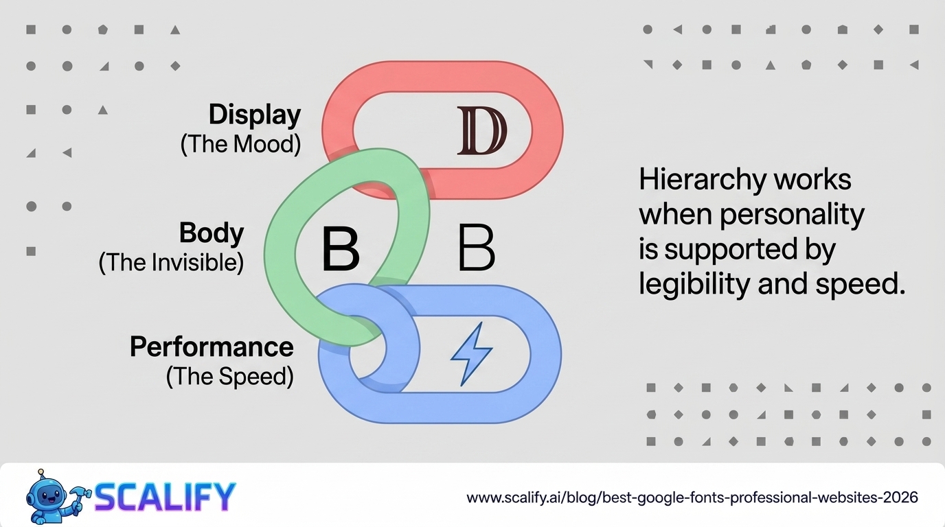
Neutrality to distinctiveness ratio: For body copy, neutrality is a virtue — the font shouldn't call attention to itself but should make reading effortless. For headings and display use, more distinctive character is appropriate. Matching each font to its role in the hierarchy matters more than finding one typeface that does everything.
The Best Sans-Serif Fonts for Body Copy
Inter
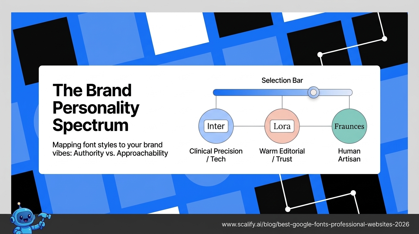
Inter has become the closest thing to an industry standard in digital product and website design. Created by Rasmus Andersson specifically for screen use, Inter was designed with the challenges of rendering on digital displays as the primary constraint — not as an adaptation of print type. The result is exceptional: highly legible at small sizes, neutral enough for body copy without feeling anonymous, with beautifully specific letterform details that become visible at larger sizes.
Inter's character differentiation is among the best available: the lowercase l, capital I, and number 1 are all clearly distinct. The letter spacing and x-height (the height of lowercase letters relative to capital letters) are calibrated for screen reading. The variable font file makes it trivial to use multiple weights without performance impact.
Inter works for: technology products, business websites, professional services, SaaS products, virtually any website where a clean, contemporary sans-serif is appropriate. It's used by Linear, Vercel, Raycast, and hundreds of high-quality product companies.
Pairing: Inter works with itself (different weights for heading vs. body), with Playfair Display for editorial contrast, with Merriweather for a softer serif combination.
DM Sans
DM Sans (the "DM" stands for DeepMind, the Google AI research lab for which it was originally designed) is a geometric sans-serif with warm character that avoids the coldness that pure geometric designs sometimes produce. It has slightly rounded terminals and careful optical adjustments that make it comfortable for body copy while maintaining enough personality to work well at headline sizes.
The lowercase 'a' in DM Sans is a double-story form (with the curved overhang) rather than a single-story form (a simple circle with a stem), which improves legibility by providing more visual distinction from the letter 'o'. This is a specific design choice that separates professional from amateur type choices.
DM Sans works for: brands that want something slightly warmer than Inter, lifestyle products, creative businesses, professional services that want approachability over authority.
Pairing: DM Sans + DM Serif Display (they were designed as a complementary system), DM Sans + Lora for a warmer editorial pairing.
Plus Jakarta Sans
A contemporary geometric sans-serif with distinctive letter construction that provides more personality than Inter or DM Sans without sacrificing the legibility needed for body copy. Its proportions are slightly wider than many geometric sans-serifs, giving it a confident, open quality at both small and large sizes.
Plus Jakarta Sans has become a popular choice for startup and technology brands that want something that reads as contemporary and design-forward. It's distinctive enough to feel chosen rather than default while maintaining the neutrality needed for running text.
Works for: tech startups, modern service businesses, digital brands, product companies.
Nunito Sans
A rounded geometric sans-serif with softer terminals that communicates approachability and friendliness. The rounding on letterform endings gives it a warmer quality than most geometric sans-serifs, making it appropriate for brands in healthcare, wellness, children's products, education, and any context where approachability is more important than authority.
The softness that makes Nunito Sans warm in appropriate contexts makes it wrong for brands that need to communicate precision, authority, or premium positioning. A Nunito Sans law firm website would feel oddly casual. A Nunito Sans wellness app feels appropriate.
The Best Serif Fonts for Professional Websites
Playfair Display
An elegant, high-contrast serif with dramatic thick-to-thin stroke variation that gives it strong personality at display sizes. The strong contrast and classical proportions make it read as editorial, sophisticated, and premium — associations that transfer to the brands that use it.
Playfair Display is best used for headings and display type — the high stroke contrast that makes it beautiful at large sizes can reduce legibility at small sizes as the thin strokes may become difficult to read. Pairing it with a clean sans-serif body (Inter, DM Sans) creates the classic editorial combination of expressive heading type with readable body copy.
Works for: fashion, luxury, editorial sites, high-end restaurants, premium professional services, boutique hotels, creative businesses positioning at the premium end of their category.
Pairing: Playfair Display headings + Inter or DM Sans body is one of the most reliable and elegant combinations available on Google Fonts.
Lora
A contemporary serif designed for body text use — moderate stroke contrast (unlike Playfair Display's dramatic contrast), warm letterform construction, and proportions optimized for comfortable reading at paragraph length. Where Playfair Display is expressive and dramatic, Lora is readable and warm.
Lora represents a design choice about personality: serif body text communicates tradition, trust, editorial quality, and craftsmanship in a way that sans-serif body text doesn't. Publications, editorial sites, and businesses whose brand story emphasizes heritage and craft often benefit from a serif body font like Lora.
Works for: editorial sites and blogs, law firms, financial services wanting a traditional feel, businesses in categories where heritage and credibility matter, personal brand sites for writers and consultants.
Merriweather
Designed specifically for reading on screens, with a large x-height, robust proportions, and reduced stroke contrast compared to classic print serifs. Merriweather is the workhorse serif for web body copy — less visually distinctive than Lora but more consistently legible across different screen types and sizes.
Works for: blogs and content-heavy sites where readability over long passages is the priority, news-adjacent publications, educational content, documentation.
Source Serif 4
Adobe's contribution to Google Fonts (originally Source Serif Pro, now available as Source Serif 4 with expanded weights). A refined, contemporary take on the traditional book serif that reads exceptionally well in body copy contexts. Professional and neutral without feeling cold — the serif equivalent of Inter's role in sans-serif.
The variable font version of Source Serif 4 provides excellent weight range in a single file, and the full font family includes a well-matched display variant for heading use.
The Best Display and Heading Fonts
Syne
A contemporary display sans-serif with distinctive letter construction — notably in the geometric, somewhat unusual letterforms that give it strong personality at large sizes. Syne is a design statement: it says this brand has specific, intentional aesthetic choices rather than default selections.
Used at display sizes (48px+), Syne creates a memorable visual identity. Used at body sizes, the distinctive letterforms can reduce legibility. The appropriate pairing is Syne for display use and a highly legible secondary font (Inter, DM Sans) for body copy.
Works for: creative agencies, design studios, tech companies with strong aesthetic positioning, startups wanting a distinctive visual identity.
Fraunces
A "wonky" optical size display serif with deliberately expressive, slightly irregular letterforms that give it a handcrafted quality. Fraunces communicates artisanal craftsmanship, personality, and a rejection of corporate sterility. It's become popular for food and beverage brands, independent creative businesses, and brands that want to feel human and specific rather than corporate and generic.
The variable font includes optical size variation — the type automatically adjusts its letter construction for different sizes, with more elaborate detail at display sizes and more restrained construction at smaller sizes.
Works for: food and hospitality brands, artisan product companies, independent creative businesses, personal brands.
Cabinet Grotesk
A geometric sans-serif with distinctive letter construction — particularly the 'a' and 'g' letterforms — that provides strong personality while maintaining professional authority. Cabinet Grotesk has become popular for technology companies, agencies, and brands positioning as innovative and design-forward.
Works for: technology companies, design agencies, product companies, brands where "design-forward" is part of the positioning.
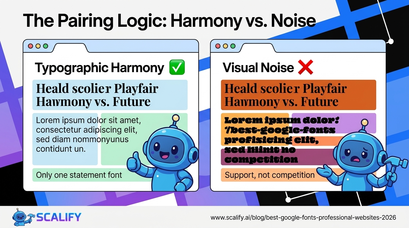
Font Pairing Principles
Great font pairings work through contrast in one dimension and harmony in others:
Serif + Sans-serif: The most reliable pairing strategy. The contrast between serif (traditional, editorial, trustworthy) and sans-serif (contemporary, clean, efficient) is enough to create typographic hierarchy while the fonts complement rather than compete. Most professional websites use some version of this combination.
Expressive display + neutral body: A distinctive, characterful heading font paired with a neutral, highly legible body font. The heading gets the personality; the body gets the readability. Playfair Display + Inter, Fraunces + DM Sans, Syne + Source Serif 4 all work this way.
Same-family variation: Using one well-designed family across different weights and styles (for example, Inter Thin for a subheading, Inter SemiBold for the heading, Inter Regular for body, Inter Bold for emphasis). This achieves hierarchy without introducing a second family. Works best with families that have strong weight differentiation.
Avoid competing for attention: Two highly expressive, distinctive fonts at the same size for the same purpose creates visual noise rather than hierarchy. The rule: only one font can be the statement; the other must support it.
Performance Considerations for Google Fonts
Google Fonts are served through Google's CDN and are generally fast — but loading multiple families and multiple weights has cumulative performance impact. Best practices:
Use variable fonts where available: A variable font file for a full weight range loads in a single request at a file size smaller than two or three static weight files. Inter, DM Sans, Plus Jakarta Sans, Lora, and many other top choices have variable font versions on Google Fonts.
Specify only the weights you use: Loading a font with weights 100, 200, 300, 400, 500, 600, 700, 800, 900 when you only use 400 and 700 loads seven unnecessary weight files. Specify exactly the weights used.
Self-host for maximum performance: Using google-webfonts-helper (gwfh.mranftl.com) or Font Source (fontsource.org) to download and self-host Google Fonts eliminates the external DNS lookup and request to Google's servers, typically improving load time by 150–300ms. This also avoids any privacy concerns about Google tracking font requests.
Preload critical fonts: The font used for above-fold headlines should be preloaded with a <link rel="preload"> tag to ensure it loads before the browser renders the text, preventing flash of unstyled text (FOUT).
The Bottom Line
The typography decisions you make for your website communicate before visitors read a word. Inter for a tech company signals precision and modernity. Playfair Display for a luxury brand signals editorial sophistication. Nunito Sans for a wellness app signals approachability. These are not arbitrary choices — they're part of the visual language that shapes how visitors perceive your brand.
The best approach: choose one expressive or distinctive font for headings and display use, and one highly legible, neutral font for body copy. Limit yourself to two families. Use the variable font versions where available. Load only the weights you'll use. The result is typography that serves the visitor's reading experience and communicates your brand's character without calling attention to itself as a design choice.
At Scalify, typography selection is part of every design process — we choose typefaces based on the specific brand personality, audience, and reading context of each site, not on defaults or trends.


.jpeg)

.jpeg)


78 SW 7th St, Miami, FL 33130


