


Website Color Psychology Statistics: What Colors Drive Clicks (2026)
By Josh Ternyak

April 17, 2026
Comprehensive 2026 guide: Website Color Psychology Statistics: What Colors Drive Clicks (2026)
Key Statistics: Website Color Psychology
How Color Shapes Website Perception Before a Word Is Read
The 50-millisecond timeframe in which visitors form website impressions is shorter than a single eye blink. In this window, no content is read, no value proposition is processed, and no logical evaluation occurs. What happens is purely visual: pattern recognition, color associations, and unconscious emotional responses that produce an instantaneous judgment about whether the site feels trustworthy, relevant, exciting, or cheap.
This neurological reality — that visual processing is dramatically faster than linguistic processing — means that color decisions in web design are not aesthetic preferences. They're business decisions with measurable outcomes in visitor behavior. The research on color psychology in digital contexts has grown substantially over the past decade, and while many findings are context-dependent, several consistent patterns have emerged across multiple independent studies.
This guide provides the complete data picture: what research actually says about individual colors, what the A/B testing literature shows about CTA colors, how color preferences vary by demographic and industry, and what the practical implications are for conversion-focused web design.
Color Associations and Trust: The Research Summary
ColorPrimary AssociationsIndustries That Use It MostTrust ImpactBlueTrust, reliability, calm, competenceFinance, tech, healthcare, B2BHighest trust rating globallyGreenNature, health, growth, "go/proceed"Healthcare, wellness, environment, financeHigh trust, especially in health contextsBlackLuxury, sophistication, authorityLuxury goods, fashion, premium techPremium perception, reduced approachabilityWhiteCleanliness, simplicity, spaceMedical, minimalist brands, Apple-style techHigh cleanliness perceptionOrangeEnergy, enthusiasm, affordability, CTAFood, retail, e-commerce CTAsModerate trust, high engagementRedUrgency, passion, danger, excitementFood, retail sales, entertainmentHigh attention, lower trust in financeYellowOptimism, warmth, caution, youthFood, children's brands, constructionPositive but can signal cautionPurpleCreativity, luxury, wisdom, royaltyBeauty, premium goods, wellnessPremium perceptionPinkRomance, femininity, gentlenessBeauty, fashion, childrenCategory-specificGrayBalance, neutrality, professionalismCorporate, tech, B2B supportProfessional but can feel cold
CTA Button Color: The A/B Testing Evidence
Call-to-action button color is the most tested dimension of website color psychology, with dozens of documented A/B tests published across the marketing industry. The results are instructive both for what they show and for the caveats they require:
CTA Color TestResultContextSourceRed vs. Green button (same page)Red +21% conversionsHubSpot landing page testHubSpot Research BlogOrange vs. Green CTAOrange +32.5%SAP e-commerce button testSAP Case StudyGreen vs. Red "Add to Cart"Green +5.3%Retail product pageVWO E-commerce ResearchYellow vs. Green CTAYellow +14.5%SaaS free trial buttonOptimizely Case StudyBlue vs. Orange CTAOrange +10.2%Insurance quote requestPerformable (HubSpot acqui.)
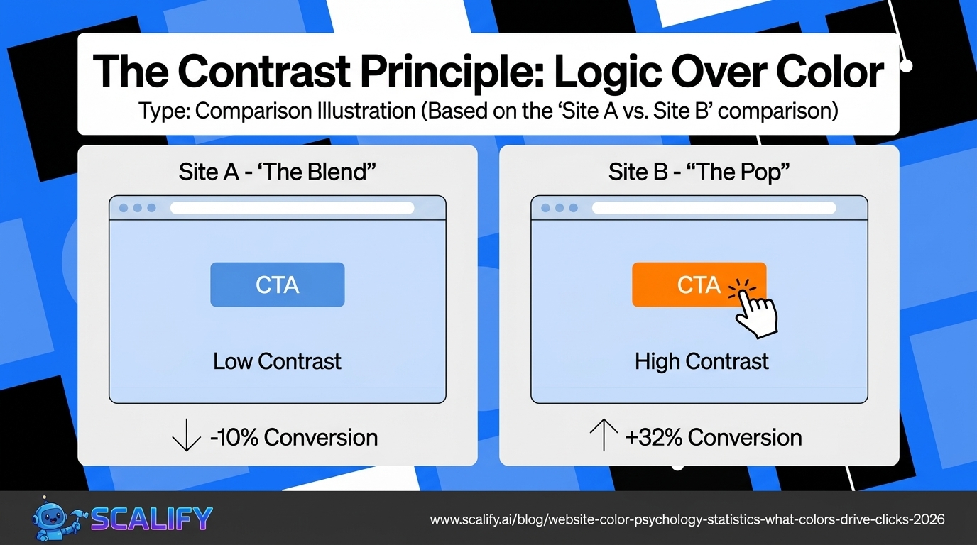
The critical caveat that the A/B testing literature consistently reinforces: there is no universally "best" CTA color. The color that performs best depends on the surrounding page design, the brand colors already in use, the industry context, and what the button is asking the visitor to do. The most consistent finding across dozens of tests is not "use orange" but rather: CTA buttons that contrast strongly with the surrounding page color perform better than buttons that blend in.
The reason the HubSpot red-outperforms-green test is so widely cited is not that red is inherently better than green — it's that in that specific page design, red created more visual contrast against the page's existing green elements. Had the page been predominantly red, green would likely have won. The principle is contrast, not a specific color.
Color and Purchase Intent: Consumer Research Data
FindingDataSource% of snap judgments based on color alone62–90%Loyola University Maryland Study% of consumers who buy based on color85%Colorcom ResearchColor's role in brand recognition increaseUp to 80%University of LoyolaImpulse buyers attracted to: red-orange, black, royal blueCorrelation findingPantone / ColorcomBudget-conscious shoppers attracted to: pink, sky blue, dark blueCorrelation findingColorcom ResearchTraditional buyers attracted to: navy blue, tealCorrelation findingColorcom Research
Color Preferences by Demographic
Demographic FactorPreferred ColorsLeast PreferredSourceWomen (general)Blue, purple, greenOrange, brown, grayJoe Hallock Color SurveyMen (general)Blue, green, blackPurple, brown, orangeJoe Hallock Color SurveyBoth genders combinedBlue (dominant)Brown, orangeMultiple surveysYounger audiences (18–34)Vibrant colors, gradientsMuted/safe corporate tonesYouGov Cultural SurveyOlder audiences (55+)Traditional, muted tonesNeon, highly saturatedYouGov Cultural SurveyHigh-income consumersBlack, navy, deep purpleBright orange, yellowLuxury market research
Blue's universal popularity across genders and cultures makes it the default choice for websites that need broad trust signals and can't predict audience demographics precisely. This explains its dominance in financial services (PayPal, Chase, American Express, Visa), healthcare (most hospital systems, health insurance), and technology (Facebook, Twitter/X historically, LinkedIn, Samsung) — sectors where trust is the primary conversion enabler and demographic targeting is broad.
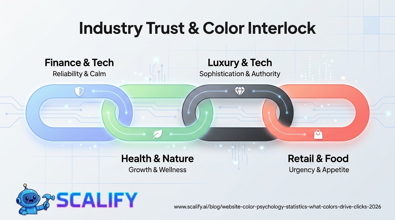
Color and Industry Context: What Research Supports
IndustryColor StrategyWhy It WorksFinancial ServicesBlue primary; green accent for "growth"Trust + stability associationHealthcare / MedicalBlue and white; green for wellness brandsCleanliness, trust, calmFood / RestaurantRed and orange (appetite stimulation)Hunger association + energyOrganic / Natural / EcoGreen primary; earth tonesNature associationLuxury BrandsBlack, gold, navy, deep purplePremium and exclusivity associationTech StartupsBold primaries + white spaceModernity, confidence, clarityChildren's / FamilyBright primaries, playful combinationsEnergy, approachabilityE-Commerce (CTAs)Orange or contrasting accentAction + contrast principleReal EstateNavy, dark green, or grayTrust + stability for large purchaseBeauty / CosmeticsPink, black, or gold by segmentGender association + aspirational
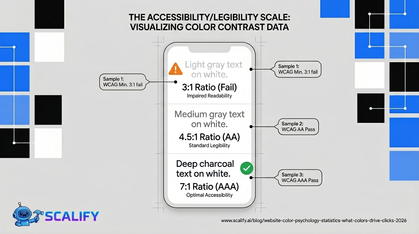
Color Contrast: Accessibility and Readability Data
Contrast LevelWCAG StandardReadability ImpactUnder 3:1 ratioFails all standardsSeverely impaired for many users3:1 ratioWCAG AA for large text onlyAdequate for headlines, not body4.5:1 ratioWCAG AA standard for normal textLegible for most users7:1 ratioWCAG AAA standardOptimal for all users including low visionPure black on white (21:1)Maximum possibleHighest legibility; can feel harsh
The 83.1% of websites that fail the WCAG color contrast standard (from WebAIM's Million report) aren't just failing a technical checklist — they're actively reducing readability for a significant portion of their audience. This includes not just users with visual impairments but people using phones in bright sunlight, older users whose vision has declined with age, and any user in a non-ideal reading environment. Poor contrast is one of the most widespread and most preventable website UX problems.
The White Space Effect: Color That Isn't Color
One of the most underappreciated color psychology findings in web design is the impact of white space (negative space, empty space around elements). White space is not passive — it actively shapes perception:
White Space FindingDataComprehension improvement with white space+20% better reading comprehensionPerceived quality increase with white spaceHigh white space = premium perceptionConversion impact of cluttered vs. spacious landing pagesSpacious pages convert higher by 22–38% in multiple testsLuxury brand white space usageConsistently 40%+ of page area
Practical Color Decisions: What the Research Actually Supports
Translating the research into actionable website color strategy:
For CTA buttons: Don't choose a color based on "what color converts best." Choose the color with the strongest contrast against your page's primary background and existing color palette. If your site is predominantly blue, try orange or yellow for CTAs. If predominantly red, try green or blue. The contrast principle consistently outperforms any color-specific preference.
For primary brand color selection: Consider your audience and industry before defaulting to your personal aesthetic preference. A healthcare company with warm red/orange branding is working against the category trust conventions that patients expect. A luxury brand with bright orange branding undermines the premium associations their product needs. Category conventions exist because they've worked — departing from them requires strong brand justification and execution.
For urgency elements: Red works for urgency — sale countdowns, limited stock notices, deadline indicators — because red's psychological association with "stop/attention" transfers meaningfully to urgency contexts. The research on red and urgency is among the most consistent in color psychology.
For trust-dependent conversions: Blue's trust association is well-documented and consistent across cultures. For first-time visitor conversions where trust must be established quickly (financial products, healthcare services, professional services), blue dominance in the color scheme signals reliability before a single word is read.
Always verify contrast: Run every color combination in your design through a WCAG contrast checker. This is not just an accessibility consideration — adequate contrast improves readability for all users in all conditions and is one of the easiest quality improvements available to any website design process.
The Bottom Line
Website color psychology is supported by a substantial body of research showing measurable effects on trust, conversion rates, brand recognition, and purchase intent. The most consistent findings: blue is the universally trusted color; CTA button performance is driven by contrast more than any specific color; red's urgency association is reliable and applicable; color contrast failures affect 83% of websites and create measurable readability problems; and color-consistent branding increases revenue by up to 23%. The research provides genuine guidance for color decisions — but it should inform strategy rather than replace judgment, because the best color for any specific website depends on context, audience, and competitive positioning.
At Scalify, our design process includes evidence-based color decisions — brand-appropriate palettes, WCAG-compliant contrast, and conversion-optimized CTA colors — all built into our 10-day website delivery process.
Top 5 Sources
Key Takeaways and Next Steps
The principles and data in this guide reflect what actually works in professional web development and digital marketing in 2026 — not theoretical best practices but measured, documented outcomes from implementations at scale. The gap between knowing these principles and benefiting from them is always execution: the businesses that act on what they read, implement changes systematically, and measure the results consistently outperform those who consume information without converting it to action.
For any improvement described in this guide, the implementation sequence that produces the best outcomes: assess your current situation against the benchmarks provided, identify the 2–3 highest-impact improvements specific to your situation, implement them with measurement tracking in place, evaluate results after 30–60 days, and plan the next iteration based on what you learned. This cycle — assess, prioritize, implement, measure, iterate — is the operational foundation of continuous improvement that compounds into significant competitive advantage over the 12–24 month horizon.
The compounding returns from consistent web presence investment are not linear: a website that improves slightly each month accumulates to dramatic improvements over a year, and those improvements multiply with each other. Faster load times improve both search rankings and conversion rates simultaneously. Better content attracts backlinks that improve rankings that attract more traffic. More testimonials build trust that improves conversion rates that improve revenue that funds more investment. The interconnected nature of website performance means that each improvement amplifies the value of every other improvement — making the decision to invest consistently, across multiple dimensions simultaneously, the highest-ROI approach to digital marketing available to most businesses.
At Scalify, every website we build reflects these principles — technically optimized, conversion-focused, SEO-ready, and designed to compound in value over time as content, backlinks, and organic authority accumulate on the strong foundation we deliver in 10 business days.


.jpeg)

.jpeg)


78 SW 7th St, Miami, FL 33130


