


The Best Nonprofit and Charity Websites: What Makes Donors Give
By Josh Ternyak

April 22, 2026
Nonprofit websites have a unique challenge: they must inspire emotional commitment, establish credibility, and make giving easy — all without the commercial conversion frameworks that for-profit sites use. Here's what the best nonprofit websites do to drive donations and engagement.
The Hardest Conversion in Web Design
Convincing someone to give money is harder than convincing them to spend it. When a consumer buys something, they receive a product or service in return — there's a direct, tangible exchange. When a donor gives to a nonprofit, they receive something more abstract: the belief that their contribution makes a difference, that the organization will use it effectively, that the cause it serves is important and their support matters. The conversion must happen almost entirely at the emotional and trust level.
This makes nonprofit website design one of the most demanding disciplines in the field. The design and content decisions that work for e-commerce or professional services don't transfer directly. Nonprofit sites must create emotional investment, establish credibility in the eyes of donors who are justifiably skeptical about charitable efficiency, make a compelling case for urgency, and provide a donation experience that's frictionless enough not to interrupt the decision that's already been made.
The best nonprofit and charity websites do all of this while also serving the other audiences a nonprofit serves — program participants, volunteers, corporate partners, grant-making foundations, media, and the general public. This guide examines what separates high-performing nonprofit websites from the majority, with specific attention to what actually drives donors to give.
The Four Things Every Nonprofit Website Must Accomplish
1. Create Emotional Investment Immediately
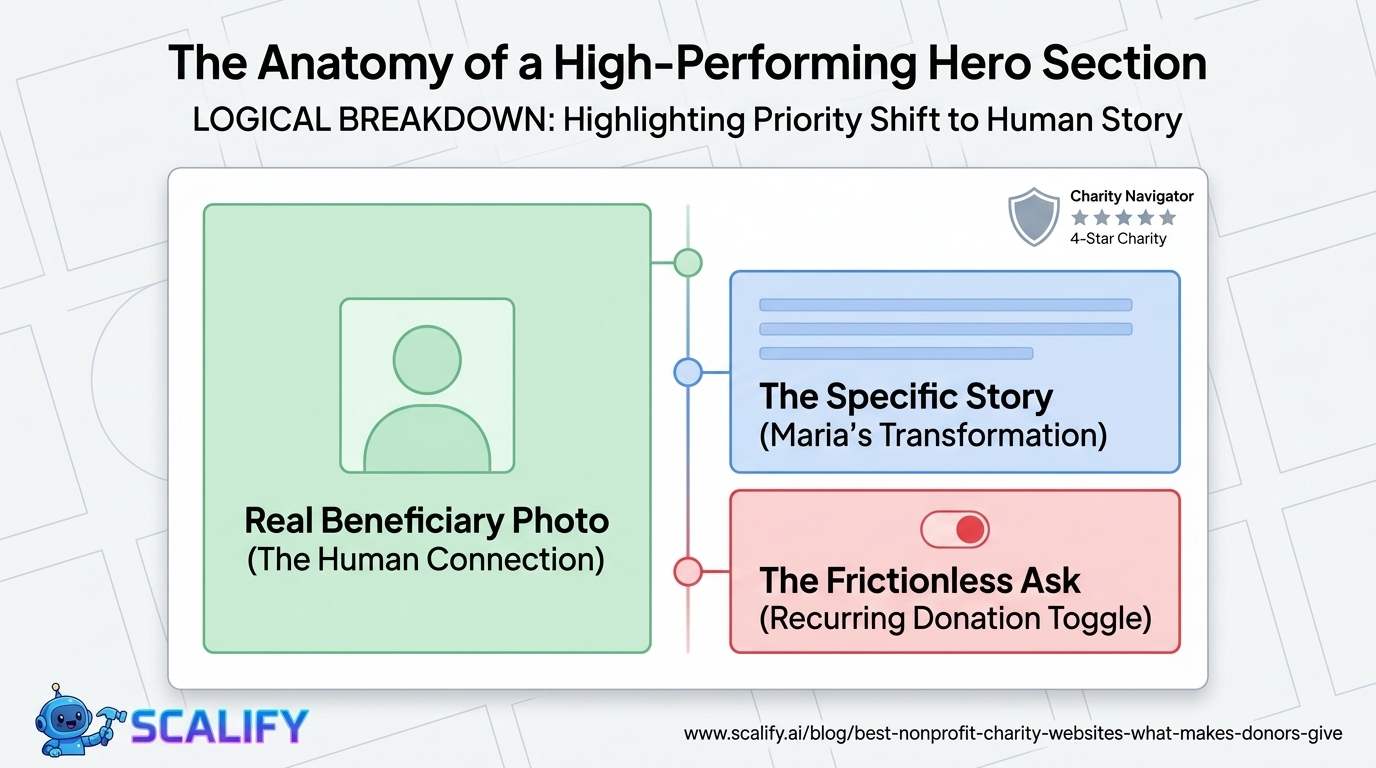
People give to causes they care about, organizations they trust, and stories that move them. Of these three, story is the most accessible to website design. A compelling story about a specific person whose life was changed by the organization's work does more to create emotional investment in 30 seconds than three pages of program descriptions and impact statistics.
The best nonprofit hero sections don't start with the organization — they start with the person the organization serves. A photograph of a real beneficiary. A short, specific story about their situation and how it changed. The emotional investment comes before the ask, before the organizational credentials, before the program descriptions. The visitor who has already felt something about a specific person's story is far more likely to keep reading, and far more likely to donate, than one who has read through program statistics first.
2. Establish Credibility That Justifies Trust
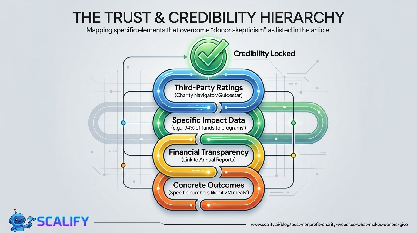
Donor skepticism is well-founded. Stories of nonprofit overhead abuse, executive compensation controversies, and programs that don't deliver promised outcomes are real. Potential donors — especially first-time donors who don't have existing relationships with the organization — need evidence that their contribution will be used responsibly and effectively.
The credibility elements that matter most to donors:
3. Make the Donation Path Frictionless
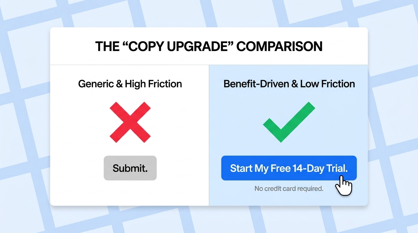
A donor who has made the emotional and rational decision to give should encounter zero friction between that decision and the completed transaction. Every additional step, every required form field, every confusing UI element between "I want to give" and "my gift is processed" costs donations.
Donation experience requirements:
4. Serve Multiple Audiences Without Diluting the Primary Message
Nonprofits serve donors, but they also serve program participants, volunteers, corporate partners, grant-making foundations, the media, and sometimes government agencies. Each of these audiences has distinct needs from the website. Managing multiple audience needs without creating a confused, diluted experience for the primary audience (typically donors or general public) requires deliberate information architecture.
The best approach: design the primary navigation and above-fold experience for the primary audience (donors/general public), and provide clear secondary navigation pathways (often in the header or footer) for other audiences: "Volunteer," "Corporate Partners," "Press," "Grant Seekers." This allows each audience to find their path without requiring the primary experience to accommodate all audiences simultaneously.
What the Best Nonprofit Websites Do Differently
They Lead with Story, Not Organization
The most common mistake on nonprofit websites: leading with organizational information — "Founded in 1987, our organization has been serving communities across five states..." — rather than with the human story that makes the organization's work meaningful.
The best nonprofit sites lead with stories. A specific name. A specific situation. A specific transformation. "Maria was sleeping in her car with her two children when she first called our shelter. Eighteen months later, she has a stable apartment, is completing her nursing assistant certification, and her children are thriving in school." This story is doing more emotional work than any amount of program description, and it's doing it in five seconds.
They Make Impact Concrete and Specific
Vague impact claims ("we're making a difference in our community") create no emotional or rational purchase for donors. Specific, quantified impact claims do both: "In 2025, our food bank distributed 4.2 million meals to 87,000 individuals across Miami-Dade County, with 94% of distributed funds going directly to food procurement."
The specificity of the impact claim is a proxy for the organization's operational rigor — organizations that can report specific numbers are organizations that measure outcomes, which is itself a marker of program quality.
Impact counters — dynamically updated numbers showing cumulative impact — are effective when the numbers are genuinely impressive and are verified. "Meals served: 4,234,891" with a live counter creates a sense of ongoing activity and scale that static numbers don't.
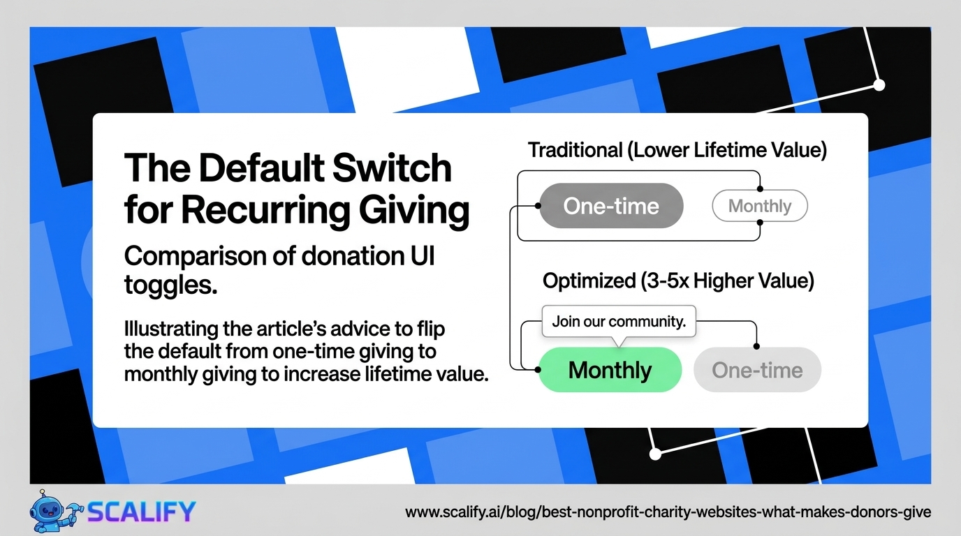
They Build Recurring Giving Into the Primary Ask
Most nonprofit websites that offer donation options present one-time giving as the default and recurring giving as an option to find if you look for it. The best nonprofit sites flip this: recurring giving is either the default or the equally prominent primary option, because the lifetime donor value of a monthly giver is typically 3–5× higher than a one-time giver at the same initial amount.
The framing of recurring giving matters: not "would you like to make this a recurring donation?" but "Join our monthly giving community — your $25/month will provide school supplies for a full academic year." The monthly giving is positioned as membership in a community, not as a billing arrangement.
They Show Real People, Not Stock Photography
Nonprofit websites that use stock photography of generic "diverse happy people" undermine the authenticity that nonprofit fundraising depends on. If a donor is being asked to trust an organization with their money because of the human impact that organization delivers, showing them the actual humans involved is essential.
Real photography — of real program participants (with appropriate consent and privacy protection), real volunteers, real staff — communicates authenticity that stock photography can't. The donor who sees a real photograph of a real person the organization has served makes an emotional connection that a stock image never enables.
They Communicate Urgency Without Manipulation
Urgency is a legitimate and important element in nonprofit fundraising — many organizations operate with genuine resource constraints, and many programs are funded to specific capacity limits. Communicating real urgency ("We have funding for 150 mentorship relationships this school year. We currently have 230 children on our waiting list. Your support can help close this gap.") is honest, compelling, and appropriate.
Manufactured urgency ("Donate in the next 24 hours!") that exists primarily to pressure donors is transparent and damages trust when donors discover there's no real urgency behind the claim. The best nonprofit sites communicate the real constraints of their work honestly.
Technical and Functional Requirements for Nonprofit Websites
Donation Processing Integration
The donation processing system is among the most critical technical decisions for a nonprofit website. Options range significantly in capabilities, fees, and donor experience:
Stripe: The standard in payment processing — used by many nonprofit-specific platforms. Lower processing fees than PayPal for standard transactions, excellent developer tools, and strong international payment support. Requires integration work but is appropriate for larger organizations with development resources.
Classy: Purpose-built fundraising platform with donation pages, campaign management, event ticketing, and peer-to-peer fundraising. Higher fees than direct Stripe integration but significantly more fundraising features.
Donorbox: Popular nonprofit donation tool with reasonable fees, easy embedding into existing websites, and recurring giving support. Good balance of ease and capability for small to mid-size nonprofits.
PayPal Giving Fund: Zero transaction fees for registered nonprofits using PayPal donations. Significant donor trust because of PayPal's brand recognition, but limited customization and donor experience quality.
Give (WordPress plugin): For nonprofits running WordPress websites, Give provides a fully integrated donation system with excellent donor management, recurring giving, and reporting without requiring a separate platform.
Email Capture and Donor Relationship Management
The donor relationship extends beyond the website visit. Email is typically the primary communication channel for nonprofit donor cultivation, and building an email list of interested potential donors — not just existing donors — is essential for long-term fundraising success.
Email capture mechanisms on nonprofit sites: newsletter signup in the footer, lead magnets (an impact report, a program guide) in exchange for email, volunteer inquiry forms that capture email as a field, and event registration (virtual or in-person) that builds the email list alongside event participation.
The CRM (Customer Relationship Management) system that manages donor data is separate from the website but should integrate with it: donation transactions should automatically update donor records, email subscribers should flow into the CRM, and volunteer data should be captured in the same system.
Accessibility and Technical Performance
Nonprofit websites serve diverse populations that may include older donors, people with visual or motor impairments, and people accessing the site on older or lower-spec devices. WCAG compliance isn't just a legal requirement — it's directly relevant to serving the full range of potential donors and beneficiaries.
Performance is equally important: mobile page speed under 2.5 seconds LCP is critical for conversion on mobile devices. Nonprofit audiences often include older donors on older devices who will experience slow sites as non-functional rather than just slow.
Design Principles Specific to Nonprofit Sites
Warmth over polish: The aesthetic quality of a nonprofit website should feel mission-aligned. A hyper-polished, corporate-feeling website can create dissonance with a mission focused on serving vulnerable populations — visitors may wonder whether organizational resources are being used appropriately. Warm, human, and professional achieves the right balance.
Color as mission expression: Nonprofit color palettes often reflect the emotional character of the mission. Environmental organizations tend toward greens and earth tones. Children's programs use warm, bright palettes. Healthcare-adjacent organizations use blues and teals that communicate trust and care. The color system should feel earned by the mission, not arbitrary.
Images of real people over abstract graphics: Nonprofits have the opportunity to show the actual humans their work affects. This opportunity should be taken. The most powerful images on any nonprofit website are authentic photographs of real program participants, taken with informed consent and presented with dignity.
The Bottom Line
Nonprofit websites that raise significant funds do so through emotional investment created by real stories, credibility established by specific impact data and transparency, frictionless donation experiences, and compelling cases for recurring giving. The organizations that treat their website as a fundraising tool rather than an informational brochure consistently outperform those that don't.
The investment in a well-designed nonprofit website is not a luxury — it's a fundraising tool with measurable return. A website that converts 2% of visitors into donors instead of 0.5% generates 4× the donations from the same traffic. At scale, this difference funds programs, staff, and impact that wouldn't otherwise exist.
At Scalify, we understand the specific design and conversion architecture that nonprofit fundraising requires — and we build websites that serve mission, credibility, and donor experience simultaneously.


.jpeg)

.jpeg)


78 SW 7th St, Miami, FL 33130


