


Website Trust Signal Statistics: What Makes Visitors Stay (2026)
By Josh Ternyak

April 17, 2026
Comprehensive 2026 guide: Website Trust Signal Statistics: What Makes Visitors Stay (2026)
Key Statistics: Website Trust Signals
The Trust Hierarchy: What Signals Matter Most
Trust on a website is not built by any single element — it's a composite of signals that collectively answer the visitor's unspoken questions: Is this a real business? Are they competent? Will they deliver what they promise? Is my data safe? Other people have used them and were satisfied?
Understanding which trust signals have the most measurable impact on visitor behavior — and at which stages of the buyer journey they matter most — allows for strategic prioritization rather than trying to add every possible trust element everywhere.
Trust Signal Impact on Conversion: Research Summary
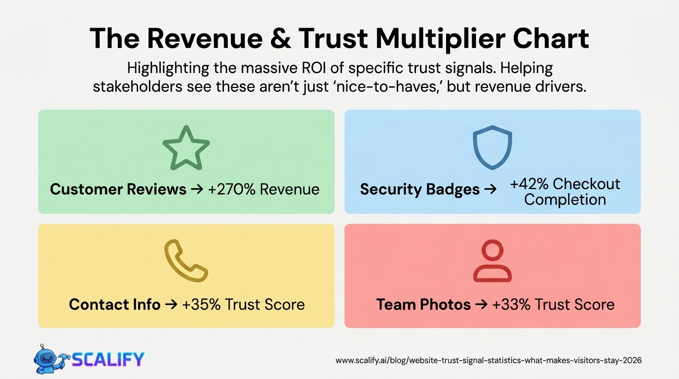
Trust SignalConversion Rate ImpactWhere It Matters MostCustomer reviews / star ratings+270% revenue (vs. no reviews)Product pages, service pages, homepageSSL certificate (HTTPS + padlock)+18% checkout completionAny page with forms or paymentSecurity badge (Norton, McAfee, etc.)+22 – 42% at checkoutCheckout, form pagesMoney-back guarantee+21% conversion for e-commercePricing pages, checkoutPhysical address + phone number+35% trust scoreContact page, footer, about pageProfessional team/founder photos+33% trust scoreAbout page, homepageVisible return policy-17% cart abandonmentProduct pages, checkoutMedia mentions / press logos+12 – 18% credibilityHomepage, about pageClient logos+11 – 22% for B2BHomepage, case studiesCase studies / testimonial videos+34% for professional servicesServices pages, homepagePrivacy policy + terms of service+8% email opt-in rateNear all forms
Design as a Trust Signal: The Visual Credibility Effect
The 75% of consumers who judge credibility by website design and the 50-millisecond impression formation timeline establish something counterintuitive: design quality is a content strategy decision, not just an aesthetic one. A visitor who registers "cheap template" in the first half-second is applying a credibility discount to everything they subsequently read — the testimonials seem less trustworthy, the pricing seems higher relative to perceived quality, and the call-to-action feels less compelling.
Design Quality PerceptionConsumer ResponseSourceUnprofessional design48% leave immediatelyStanford Web Credibility ResearchOutdated design (3+ years old)73% consider untrustworthyBusiness.com ResearchDesign inconsistency (brand mismatch)-21% trust vs consistent brandLucidpress Brand Consistency StudyPoor readability (contrast, font)-19% credibility scoreWAVE Web Accessibility StudyStock photo overuse (vs real photos)-16% trust vs authentic photosNielsen Norman Group Eye-Tracking
Review and Social Proof Statistics
Social Proof ElementDataSource% consumers who check reviews before purchase93%BrightLocal% who trust online reviews as much as personal rec.88%BrightLocalMinimum reviews before consumer trusts a business10+ reviewsBrightLocalImpact of star rating on click-through rate+17% CTR for 4.5-star vs. no ratingMoz LocalRevenue increase from 5-star vs 1-star reviewsSignificant (Harvard: 1 star = 5–9% revenue)Harvard Business School% consumers who read response to negative reviews41%BrightLocalTrust impact: reviews with photos vs text only+38% trust for photo reviewsPowerReviewsVerified purchase badge on reviews+15% trust vs. unverifiedAmazon / Nielsen research
The 10-review minimum before consumers trust a business is a critical threshold for businesses managing their review presence. A business with 2 reviews — even both 5-star — triggers more skepticism than a business with 47 reviews averaging 4.3 stars. Volume is a trust signal independent of rating because it demonstrates that the business has served enough customers to generate a meaningful sample, reducing the concern that the few reviews are from friends or family.
Security Trust Signals: The Checkout Conversion Effect
Security SignalPlacementConversion ImpactSSL padlock (HTTPS) in address barBrowser-level+18% checkout completion vs HTTPSecurity badge (Norton, McAfee, etc.)Near payment form+22 – 42% checkout completionPayment method logos (Visa, Mastercard, PayPal)Checkout page+10 – 15% checkout completionMoney-back guarantee badgeBelow CTA button+19 – 28% conversionPrivacy assurance micro-copyBelow email field+5 – 10% form conversionPCI compliance statementCheckout page+8% for security-conscious segments
The security badge research reveals something important about consumer psychology: the SSL padlock in the browser address bar (which is the actual technical security indicator) is less persuasive than a visually prominent third-party security badge on the page. The padlock is technically correct but cognitively easy to miss; a Norton or McAfee badge placed directly below the payment form is visually prominent and triggers a specific security-brand trust response. Both are important, and they work through different psychological mechanisms.
Contact Information: The "Is This a Real Business?" Signal
Contact Information ElementTrust Impact% of Sites That Have ItPhone number (visible, not just in contact page)+26% trust score~58%Physical address (for non-local businesses)+21% trust score~44%Email address (direct, not just form)+14% trust score~62%Live chat widget (visible)+19% trust score~38%Business registration / license number+12% for regulated industriesLowNamed contact person (vs. "our team")+18% for professional services~35%
The most consistently effective trust signal that most small business websites still get wrong is contact information accessibility. 42% of businesses don't have their phone number prominently placed in the website header or homepage — yet 61% of website visitors specifically look for contact information when evaluating whether to trust a business. A phone number in the site header or visible without scrolling sends the signal "we are a real business and we are reachable" in the most direct way possible.
.jpeg)
The Trust Gap by Business Age and Size
Business TypePrimary Trust ChallengeMost Important SignalNew business (under 1 year)No history, no reviewsFounder story, certifications, initial reviewsSmall local businessAppears amateur vs. larger chainsProfessional photos, reviews, addressE-commerce (no physical presence)No accountability signalsReviews, return policy, security badgesProfessional servicesQualifications not visibleCredentials, case studies, testimonialsB2B companyStability and capability uncertaintyClient logos, case studies, team pageOnline-only service"Too easy to disappear" concernAddress, phone, payment security, reviews
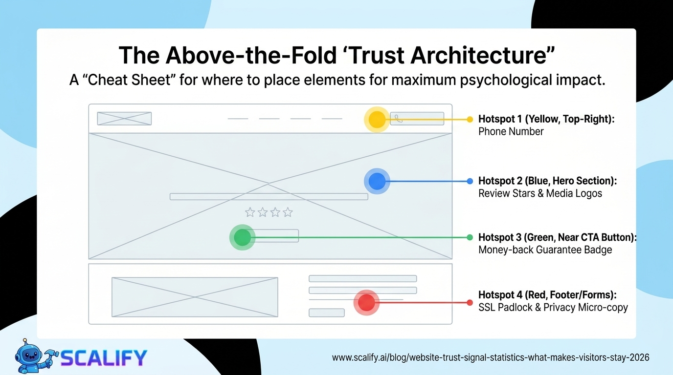
Above-the-Fold Trust: The First 50 Milliseconds
The 50-millisecond trust window means that the content above the fold — what's visible without scrolling — carries a disproportionate trust burden. Visitors decide within a single glance whether to continue reading, and that decision is based entirely on visual processing rather than content comprehension.
The above-the-fold trust optimization checklist:
Trust Signal Placement Optimization
Trust SignalOptimal PlacementWhyPhone numberTop-right headerUniversal expected location; immediate contact signalReview stars / countHomepage hero, near CTAsInfluences first impression and conversion momentSecurity badgesDirectly below payment form / CTAsReduces anxiety at highest-stakes momentMoney-back guaranteeNear price / CTA buttonAddresses risk concern at purchase decisionMedia logos ("As seen in")Homepage, below heroThird-party validation early in journeyClient logosHomepage or dedicated sectionSocial proof with brand recognition boostCase studiesServices pages, dedicated sectionEvidence at the research stageTeam photos + biosAbout page (linked from homepage)Humanization for service businesses
The Bottom Line
Website trust signals have measurable, documented impact on conversion rates across virtually every business category. The most impactful signals — customer reviews (+270% revenue), security badges (+22–42% checkout conversion), money-back guarantees (+21%), and visible contact information (+35% trust score) — are all implementable in days, not months. The 75% of consumers who judge credibility by website design establish that design quality itself is a trust signal that precedes every other element on the page. Building trust on a website is not primarily a copywriting exercise — it's a design, social proof, and contact information exercise that produces measurable conversion outcomes.
At Scalify, we build websites with trust optimization as a foundational design principle — the right signals in the right places to convert the visitors your marketing brings in.
Top 5 Sources
Building Trust Systematically: The Trust Architecture Approach
Trust signals work best when they're integrated throughout the website as a coherent system rather than added as isolated elements. A website with a single prominent review widget but no visible security badge, no named team, and no clear policy information has gaps in its trust architecture that skeptical visitors will find. A website with trust signals at every appropriate touchpoint — credibility signals in the header, social proof adjacent to the value proposition, security badges at checkout, testimonials near CTAs, and transparent policies in the footer — has built a trust ecosystem that surrounds every decision point with reassurance.
The trust architecture framework: identify the specific concerns your target customers have at each stage of their journey (What does this company do? Is it legitimate? Will they deliver? Is my payment safe? What happens if something goes wrong?) and place trust signals that address each concern at the exact point where it's most likely to arise. This systematic approach to trust signal placement consistently outperforms ad-hoc addition of trust badges and testimonials, because it ensures every significant trust concern has a corresponding signal rather than assuming the most prominent elements cover all doubts.
Trust signal effectiveness also varies significantly by customer segment and product type. High-ticket B2B purchases require different trust signals than consumer impulse purchases. Healthcare services require clinical credentialing signals that a software product doesn't need. E-commerce requires payment security badges that a service business doesn't display. Matching trust signals to the specific concerns of your specific customer segment produces higher conversion improvement than deploying generic trust badges that may not address what your particular visitors are actually worried about.
Key Takeaways and Next Steps
The principles and data in this guide reflect what actually works in professional web development and digital marketing in 2026 — not theoretical best practices but measured, documented outcomes from implementations at scale. The gap between knowing these principles and benefiting from them is always execution: the businesses that act on what they read, implement changes systematically, and measure the results consistently outperform those who consume information without converting it to action.
For any improvement described in this guide, the implementation sequence that produces the best outcomes: assess your current situation against the benchmarks provided, identify the 2–3 highest-impact improvements specific to your situation, implement them with measurement tracking in place, evaluate results after 30–60 days, and plan the next iteration based on what you learned. This cycle — assess, prioritize, implement, measure, iterate — is the operational foundation of continuous improvement that compounds into significant competitive advantage over the 12–24 month horizon.
The compounding returns from consistent web presence investment are not linear: a website that improves slightly each month accumulates to dramatic improvements over a year, and those improvements multiply with each other. Faster load times improve both search rankings and conversion rates simultaneously. Better content attracts backlinks that improve rankings that attract more traffic. More testimonials build trust that improves conversion rates that improve revenue that funds more investment. The interconnected nature of website performance means that each improvement amplifies the value of every other improvement — making the decision to invest consistently, across multiple dimensions simultaneously, the highest-ROI approach to digital marketing available to most businesses.
At Scalify, every website we build reflects these principles — technically optimized, conversion-focused, SEO-ready, and designed to compound in value over time as content, backlinks, and organic authority accumulate on the strong foundation we deliver in 10 business days.


.jpeg)

.jpeg)


78 SW 7th St, Miami, FL 33130


