

How to Make Your Website Call-to-Action More Effective (2026)
By Josh Ternyak

April 17, 2026
Personalized CTAs convert 202% better than generic ones. This comprehensive guide covers the 4 elements of effective CTAs, copy principles (first-person, specific, benefit-focused), design (contrast, size, placement), mobile optimization, A/B testing approach, common mistakes, CTA strategy by page type (homepage, blog, pricing, landing pages), and how to measure CTA performance at multiple funnel levels.
How to Make Your Website Call-to-Action More Effective
The call-to-action (CTA) is the single most important element on any conversion-focused web page. It's the moment where a visitor's interest becomes a declared intent — and the difference between a CTA that converts 2% of visitors and one that converts 6% of the same visitors is purely a function of design decisions that are entirely within your control. Most websites underperform not because of poor traffic quality or weak products but because their CTAs are ambiguous, visually buried, or ask for commitment at the wrong moment in the visitor's decision journey.
Key CTA Statistics
The 4 Elements of an Effective CTA
ElementWhat It DoesWeak ExampleStrong ExampleCopy (the words)Communicates what happens and the immediate benefit"Submit" / "Click Here" / "Learn More""Start My Free 14-Day Trial" / "Get My Free Website Audit"Design (button appearance)Signals clickability and draws the eyeSmall gray button matching page backgroundLarge, high-contrast button with clear affordancePlacement (where on the page)Meets the visitor at the right moment in their decision journeyOnly in the footer after 3,000 words of contentAfter value proposition; after social proof; after addressing objectionsFriction level (what it asks)Matches the commitment required to the trust built"Buy now" on first visit, no price shown"Start free trial — no credit card required"
CTA Copy: The Highest-Impact Variable
CTA button copy has more impact on conversion than any other CTA element — and it's also the element most websites get wrong by defaulting to generic, uncommitted language. The principles of high-converting CTA copy:
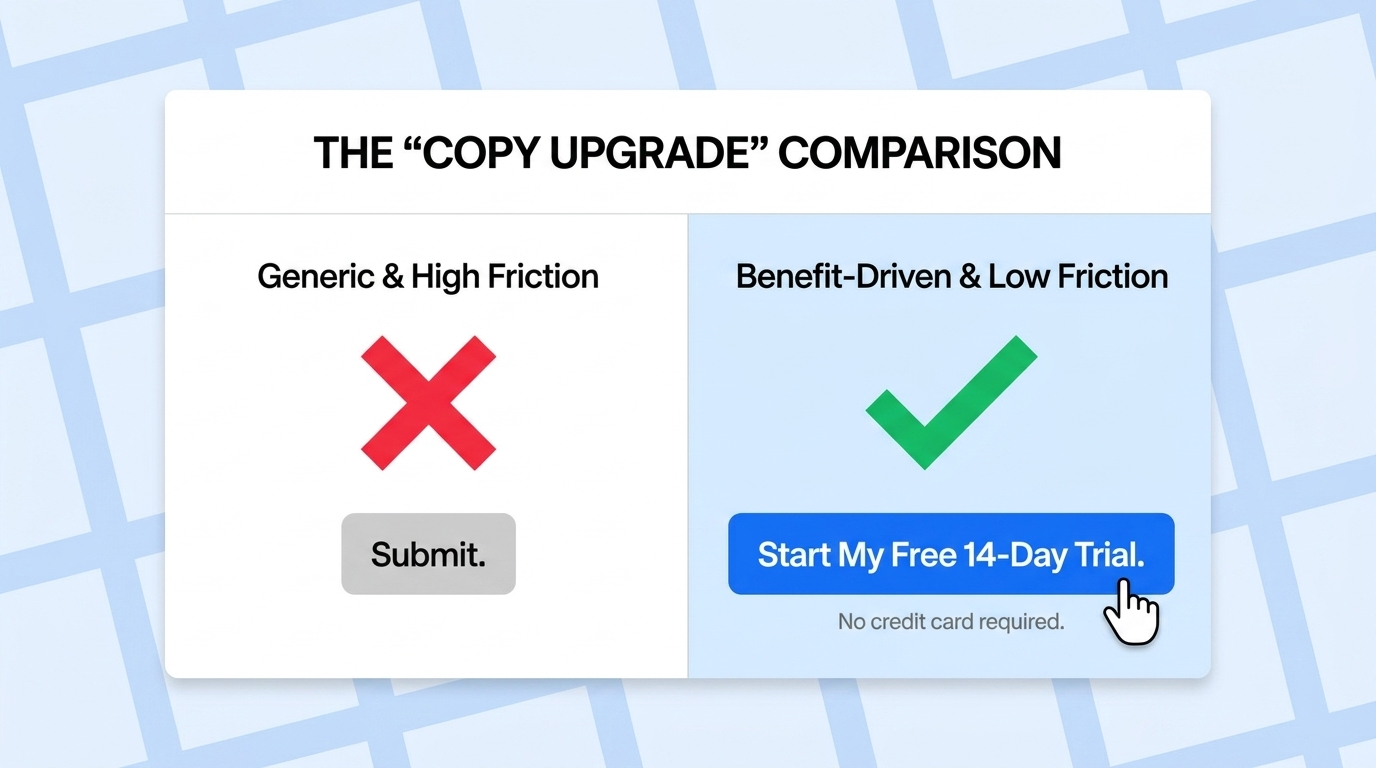
Be specific about what happens next. "Get Started" tells a visitor nothing about what starting looks like. "Start My Free 14-Day Trial" tells them they'll start a trial, it's free, and it lasts 14 days. Specificity reduces uncertainty, and uncertainty is the enemy of conversion. Every word of ambiguity in CTA copy costs clicks from visitors who aren't sure what they're agreeing to.
Use the first person where possible. "Start my free trial" outperforms "Start your free trial" by approximately 90% in A/B tests across multiple platforms. The first-person framing makes the CTA feel more personal and self-directed — the visitor is taking action for their own benefit, not responding to the company's instruction. This subtle linguistic shift consistently produces meaningful conversion improvements.
Emphasize the benefit, not the action. "Schedule a Demo" emphasizes what the visitor does; "See How [Product] Works" emphasizes what they get. The benefit framing speaks to what the visitor actually wants — to understand the product — rather than what they need to do to get there.
Address the primary objection in the CTA or directly beneath it. For free trial CTAs, the primary objection is "will I be charged?" — answer it: "Start Free Trial — No Credit Card Required." For consultation CTAs, the objection is "will I be harassed by sales?" — address it: "Schedule a Call — No pressure, 30 minutes." Objection-handling copy directly beneath a CTA consistently increases conversion by 8–18%.
CTA Design: Making It Visually Unmissable
Design ElementBest PracticeCommon MistakeImpactColor contrastButton color must stand out clearly from page background and nearby elementsGray button on white background; brand color button on brand color backgroundHigh — low-contrast buttons are visually skippedButton sizeLarge enough to be unmissable on desktop; min 44px tall on mobileSmall button matching body text sizeMedium-High — small buttons get fewer clicks especially on mobileWhite space around buttonAdequate padding and surrounding space so button is visually isolatedButton crowded by text or other elementsMedium — visual breathing room increases click probabilityButton shapeClearly looks like a button — rounded rectangle or rectangle with obvious affordanceFlat text link styled as "CTA" with no button appearanceMedium-High — visitors must recognize it as clickableSingle most prominent CTA per pageVisual hierarchy makes one CTA clearly primary; others clearly secondaryFive equally prominent buttons on one pageVery High — competing CTAs dramatically reduce conversion
CTA Placement: Meeting Visitors at the Right Moment
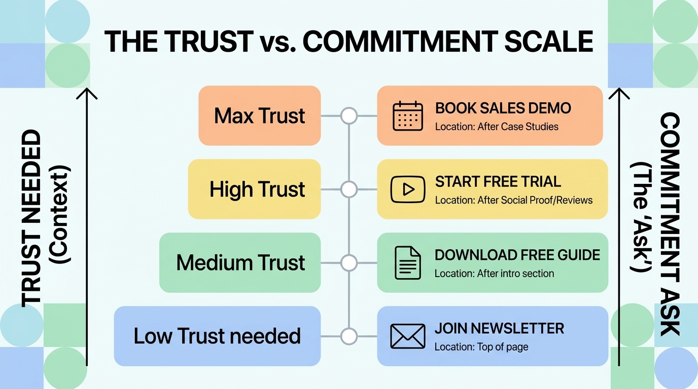
The conventional wisdom that CTAs should always be "above the fold" is partially right and significantly oversimplified. The right placement for a CTA depends on the complexity of the offer and the amount of education needed before a visitor will act.
For simple, low-commitment offers (free newsletter signup, free download, email capture), above-the-fold CTAs perform well because the visitor's trust requirement is low and the commitment is minimal. For complex, high-commitment offers (scheduling a sales call, starting a paid trial, requesting a custom quote), CTAs placed after value explanation, social proof, and objection handling consistently outperform those placed before this context is established. A visitor who encounters "Schedule a Demo" before understanding what the product does and who it serves has none of the information they need to make that commitment.
The most effective CTA placement strategy: multiple CTAs on a page, each placed at natural decision points after relevant value has been established. An above-fold CTA for the highly motivated visitor who already knows they want to act; a CTA after the features section for visitors evaluating fit; a CTA after testimonials for visitors looking for social validation; and a final CTA in the footer for visitors who've read everything and are ready to act.
Mobile CTA Optimization
Mobile CTA optimization requires different considerations than desktop. With 60%+ of most website traffic arriving on mobile devices, CTAs that work well on desktop but poorly on mobile are leaving significant conversion value on the table. Mobile-specific CTA requirements:
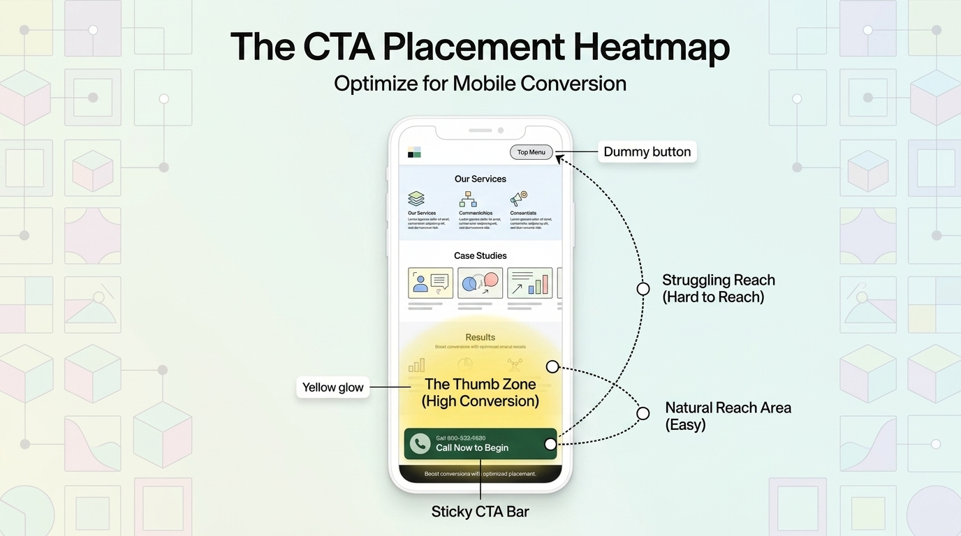
Minimum tap target size. Google's guidelines and accessibility standards specify minimum 44px × 44px tap targets. Buttons smaller than this result in frequent accidental misses on mobile — visitors tap near the button but miss it, then give up or repeat the attempt with frustration. Every additional attempt-before-success increases the probability of abandonment.
Thumb-zone placement. On most mobile screens, the natural thumb reach zone is the lower center and lower right of the screen. CTAs placed at the top of the screen require hand repositioning — a subtle friction that reduces conversion. Where possible, design mobile CTAs to be accessible without hand repositioning.
Sticky CTA bars. Fixed-bottom CTA bars that scroll with the user — "Get Started | Call Now" — dramatically increase mobile CTA visibility and conversion by ensuring the CTA is always visible regardless of scroll position. For service businesses where phone calls are a primary conversion, a sticky "Call Now" bar is one of the highest-ROI mobile CTA implementations available.
Testing Your CTAs: A/B Testing Approach
CTA testing should be single-variable (change one element at a time) and run until reaching statistical significance (typically 95% confidence with 100+ conversions per variant). The highest-impact CTA elements to test, in priority order: CTA copy (highest impact, easiest to change), CTA placement on the page (high impact for complex offers), CTA design/color (medium impact), and surrounding social proof (medium impact). Don't test CTA color before testing CTA copy — copy improvements consistently produce larger conversion improvements than design tweaks, and starting with the highest-impact variable produces faster, more valuable results.
CTA Mistakes That Kill Conversion
Multiple competing primary CTAs. A page with "Start Free Trial," "Schedule a Demo," "Download Our Guide," and "Contact Us" all presented as equally prominent options forces visitors into a decision about which action to take before they've decided to take any action. Pick one primary CTA; make others clearly secondary. The reduction in options consistently increases the primary CTA's conversion rate.
Generic copy that doesn't describe the outcome. "Submit," "Click Here," and "Learn More" are non-committal, non-specific, and give visitors no reason to take action. Every CTA should communicate what happens next and why it benefits the visitor.
No CTA until the end of very long pages. Visitors who become interested partway through a long page should have access to a CTA at that moment, not 2,000 words later. Placing CTAs at natural interest peaks throughout long-form content captures the visitors who are ready to act before reaching the page's end.
The Bottom Line
Effective CTAs combine specific, benefit-focused copy, high-contrast design that's visually unmissable, placement at the right moment in the visitor's decision journey, and friction levels that match the trust established. Personalization, first-person copy, single focused CTAs per page, mobile tap target compliance, and objection-handling text adjacent to CTAs are the highest-impact improvements most websites can make to their CTA performance — most requiring no new traffic, no new content, and no significant budget. Start with the CTA copy, then placement, then design — and measure everything with A/B tests that run to statistical significance.
At Scalify, every website we build has conversion-optimized CTAs — specific, high-contrast, strategically placed, and mobile-compliant from day one.
Top 5 Sources
CTA Strategy by Page Type
Different page types require different CTA strategies based on the visitor's intent and the appropriate conversion depth at each stage of the buyer journey:
Homepage: The homepage serves visitors at many different stages — some just arrived from a brand search, others are referrals already ready to buy. The homepage CTA should target the primary conversion goal (most businesses: start trial, request consultation, contact) with a clear primary CTA and secondary navigation to support research. A common mistake is making the homepage CTA too generic ("Learn More") for visitors ready to act, or too committal ("Buy Now") for visitors still in awareness mode. "Start Your Free Trial" or "Get a Free Consultation" balance commitment with accessibility.
Blog posts and content pages: Content page visitors are typically in research and awareness mode — they found the article through a search query, they're reading for information, and they're not immediately ready to commit to a purchase or consultation. The best CTAs for content pages match the visitor's stage: email newsletter signup, free resource download, or free tool access — something that provides immediate value while beginning a relationship. The CTA should be relevant to the article topic: a blog post about SEO tips should offer a free SEO audit rather than a generic newsletter signup.
Pricing pages: Pricing page visitors are in high-intent evaluation mode — they're comparing options and considering whether the value justifies the cost. CTAs here should reduce friction: "Start Free Trial," "See a Demo," or "Talk to Sales" depending on the product's complexity. Pricing page visitors who click a CTA are some of the highest-converting traffic on any SaaS site — ensure the CTA experience is seamless and immediately rewarding.
Landing pages: Dedicated landing pages for paid advertising or specific campaigns should have a single CTA with no navigation distractions. The entire page should funnel toward one action. Landing pages with navigation menus see 10–25% lower conversion than those without — removing distractions from landing pages is one of the most consistently validated CTA optimizations available.
Measuring CTA Performance
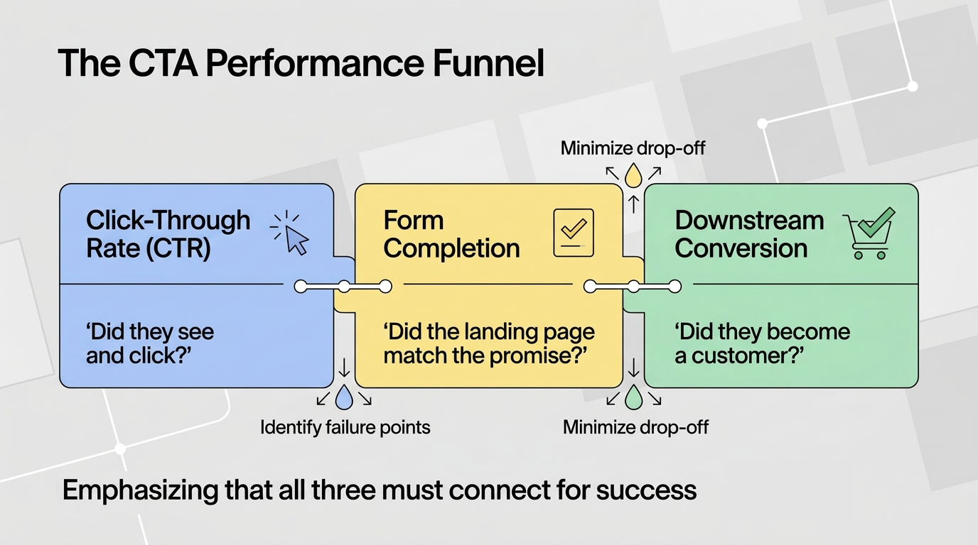
CTA performance should be measured at multiple levels: click-through rate (CTR) on the CTA button itself, form completion rate for CTAs that lead to forms, and downstream conversion rate (did the people who clicked the CTA ultimately become customers?). A CTA with high CTR but low form completion rate signals a mismatch between what the CTA promises and what the form delivers. A CTA with high form completion but low downstream conversion signals a lead quality problem — the CTA is attracting the wrong visitors or setting wrong expectations. Tracking all three levels reveals where the conversion funnel is actually breaking and where optimization effort should be focused.
Google Analytics 4 event tracking for CTA clicks, Google Tag Manager for cross-domain form tracking, and heatmaps (Hotjar, Microsoft Clarity) for understanding exactly where visitors engage and ignore CTAs are the minimum measurement toolkit for serious CTA optimization. The investment in proper measurement infrastructure pays for itself in the faster testing cycles and more informed optimization decisions it enables.


.jpeg)

.jpeg)


78 SW 7th St, Miami, FL 33130


