


Mobile vs Desktop Website Traffic Statistics 2026: Complete Data Guide
By Josh Ternyak

April 17, 2026
Mobile now accounts for over 64% of global web traffic — but the story behind mobile vs. desktop usage is more nuanced than a single headline number. This comprehensive guide covers traffic distribution by region, industry, age group, and how the shift changes what websites need to do.
Key Statistics: Mobile vs Desktop Traffic 2026
The Mobile Majority: How We Got Here
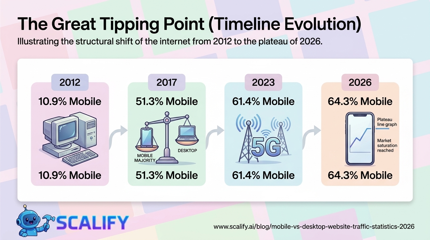
The fact that mobile devices now generate nearly two-thirds of all global web traffic represents one of the most significant structural shifts in the history of the internet — and it happened faster than most industry observers predicted. As recently as 2012, mobile accounted for less than 20% of global web traffic. The transition from desktop-dominant to mobile-dominant happened over roughly an eight-year period, driven by the convergence of three major forces: falling smartphone prices that made mobile internet access affordable to billions of new users in developing markets, improvements in cellular network infrastructure (3G to 4G to 5G), and the deliberate design of apps and mobile-optimized experiences that made mobile browsing genuinely functional rather than a degraded desktop fallback.
Understanding the mobile traffic story requires understanding that it isn't one story — it's several distinct stories playing out simultaneously in different markets, demographics, and industry verticals. The aggregate 64.3% global mobile traffic share masks dramatic variation that determines how businesses should actually allocate their design and development resources.
Mobile vs Desktop Traffic: Global Distribution by Year
YearMobile %Desktop %Tablet %Key Context201210.9%85.3%3.8%iPhone 4S, Android mainstream begins201426.5%67.4%6.1%Affordable Android proliferates globally201640.4%52.8%6.8%Mobile passes 40% globally201751.3%43.9%4.8%Mobile becomes majority for first time201853.3%43.0%3.7%Google announces mobile-first indexing202056.9%40.0%3.1%COVID; desktop usage temporarily rebounds202157.0%40.1%2.9%Hybrid work stabilizes desktop share202361.4%36.5%2.1%Continued mobile growth202563.7%33.8%2.5%5G driving mobile growth202664.3%33.2%2.5%Growth plateauing in developed markets
The 2020 data point is a notable anomaly — COVID-19 actually caused a temporary rebound in desktop usage as office workers transitioned to home offices and spent more time on desktop computers for work. This underscores that the mobile shift, while dominant, is sensitive to behavioral context. Desktop usage stabilized rather than disappearing, settling into a persistent ~33% share representing primarily professional and productivity contexts.
Mobile vs Desktop Traffic by Country
CountryMobile ShareDesktop ShareReason for PatternIndia77.2%20.8%Mobile-first internet infrastructure, low desktop penetrationNigeria79.8%18.1%Near-exclusive mobile internet accessIndonesia75.4%22.3%Mobile-dominant market, limited broadbandBrazil68.9%28.6%Strong smartphone adoption, growing 5GMexico67.4%29.8%Mobile-first digital growth marketChina73.2%24.1%Super-app ecosystem (WeChat) drives mobileUnited States58.7%38.2%High desktop use in professional contextsGermany52.6%44.3%Higher desktop use in European professional settingsUnited Kingdom56.2%40.8%Balanced; professional desktop use highJapan63.8%32.9%Advanced mobile infrastructure, high smartphone use
The country-level data reveals a critical strategic insight: businesses with primarily US or European audiences should not assume the same mobile share applies to them as the global average suggests. A B2B software company with a US enterprise audience likely sees 45–55% mobile traffic, not 64.3%. A consumer app targeting India or Indonesia may see 75–80% mobile traffic. Getting the right number for your actual audience — from your analytics — is more valuable than the global average for any specific business decision.
Mobile vs Desktop Traffic by Industry
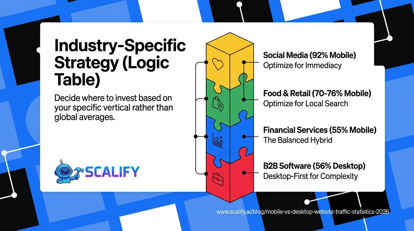
IndustryMobile ShareDesktop ShareNotesSocial Media Platforms92%8%Near-exclusively mobile behaviorEntertainment / Streaming78%20%Mobile consumption dominantNews & Media72%26%Breaking news behavior is mobileE-Commerce / Retail70%28%Browse mobile; buy desktop commonTravel68%30%Search mobile; book desktop commonFood / Restaurant76%22%Location-based searches; highly mobileHealthcare62%36%Appointment booking drives mobileFinancial Services55%43%Complex tasks keep desktop share higherB2B Software / SaaS42%56%Primarily professional desktop contextLegal / Professional Services48%49%Near-parity; depends on user context
These industry-level differences are some of the most actionable data in this guide. A B2B SaaS company that treats its website primarily as a mobile experience is optimizing for the minority of its audience. A restaurant that treats its website primarily as a desktop experience is ignoring 76% of the people who find it. Industry context should be the primary driver of mobile optimization priority — not the global headline number.
The Mobile Revenue Gap: Why Mobile Traffic Doesn't Equal Mobile Revenue
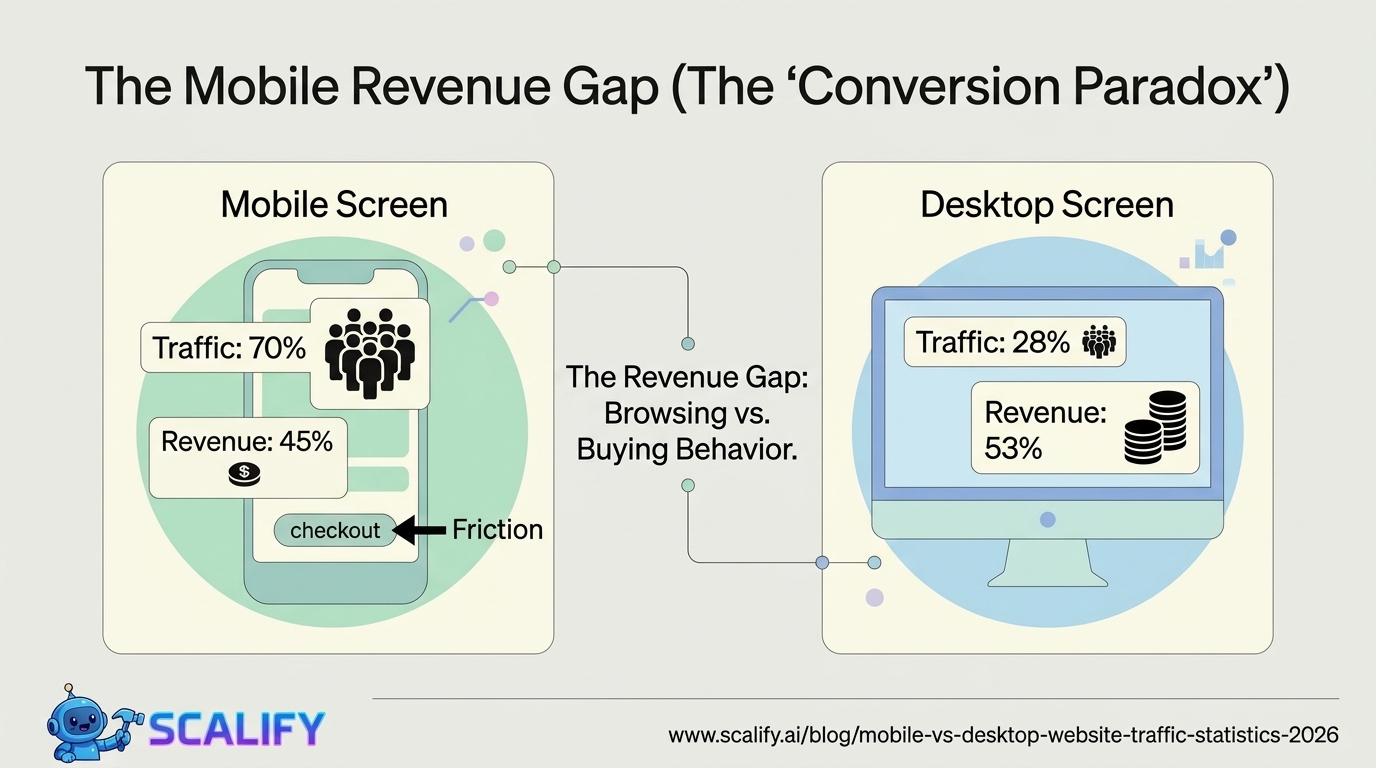
One of the most important nuances in the mobile vs desktop data is what researchers call the "mobile traffic gap" — the phenomenon where mobile devices generate a disproportionate share of traffic but a disproportionately small share of revenue. This gap is particularly pronounced in e-commerce:
MetricMobileDesktopGapShare of e-commerce traffic70%28%Mobile +42 pointsShare of e-commerce revenue45%53%Desktop +8 pointsAverage order value$74$127Desktop +72%Cart abandonment rate78%65%Mobile +13 pointsCheckout completion rate22%35%Desktop +59%
The mobile revenue gap has two explanations: behavioral and technical. The behavioral explanation is that mobile devices are used for browsing and research while desktop is used for final purchase decisions — particularly for higher-value items. Mobile commerce is often part of a multi-device journey where the final transaction happens on desktop. The technical explanation is that mobile checkout experiences are genuinely more friction-filled than desktop — smaller keyboards, more complex form entry, security concerns about payment on mobile, and slower performance all reduce conversion rates.
The implication for businesses: optimizing mobile checkout friction is one of the highest-ROI activities available. Apple Pay and Google Pay integrations, simplified checkout flows, and mobile-optimized form inputs collectively address the friction-driven portion of the mobile revenue gap. Companies that have implemented these optimizations see their mobile revenue share increase significantly.
Session Duration and Engagement: Mobile vs Desktop
MetricMobileDesktopNotesAverage session duration3m 42s7m 12sDesktop nearly 2x longerAverage pages per session2.74.2Desktop visits deeperBounce rate (overall)51%43%Mobile 18% higher bounceReturn visitor rate28%38%Desktop has more loyal/repeat audienceForm completion rate36%58%Desktop forms completed far more often
The session duration difference — mobile users spend approximately half as long as desktop users — is not primarily a sign of dissatisfaction. It reflects the different contexts in which mobile browsing occurs. Mobile sessions are frequently interstitial — checking something quickly while waiting, looking up a business on the way, scanning social media. Desktop sessions occur in more focused, deliberate contexts (research, shopping, work). Designing for mobile means designing for brevity and clarity, not trying to engineer longer sessions.
Google's Mobile-First Indexing: What It Means
Google switched to mobile-first indexing as the default for all new websites in 2019 and completed the migration of all existing websites to mobile-first indexing by 2023. The implications of this are significant and often misunderstood:
Mobile-first indexing means Google's crawlers primarily access the mobile version of your website — not the desktop version — when evaluating content for search rankings. If your mobile site has less content than your desktop site, has images that don't load correctly on mobile, or has structured data that's present on desktop but missing on mobile, these will negatively affect your search rankings — even for searches done on desktop computers.
This means the mobile experience isn't just an optimization for mobile users — it's the definitive version of your website from Google's perspective. Companies that still treat mobile as a secondary experience are not just failing mobile users — they're potentially limiting their desktop search rankings as well.
Age Demographics and Device Preference
Age GroupPrimary Device for Web BrowsingMobile Traffic Share16–24 yearsMobile (dominant)78%25–34 yearsMobile (slight)68%35–44 yearsMixed (near-parity)57%45–54 yearsDesktop (slight)48%55–64 yearsDesktop39%65+ yearsDesktop (strong)28%
Age demographics create another important dimension for business-specific strategy. A brand targeting Gen Z and Millennials is reaching an audience that is 68–78% mobile. A brand targeting 55+ audiences — Medicare supplements, retirement planning, senior care services — is reaching an audience where desktop is the primary device. These differences should directly influence design priorities, not the global average.
What the Mobile Traffic Shift Means for Website Design
The mobile-dominant traffic reality translates into a set of specific design imperatives that are now considered professional standards rather than optional enhancements:
Mobile-First Design Approach
Mobile-first design means starting the design process with the mobile layout — the most constrained screen size — before designing for larger screens. This forces prioritization decisions: if you can only fit three navigation items on a mobile screen, which three matter most? This constraint produces more focused, clearer information hierarchies than starting with a desktop canvas that has room for everything.
Touch Target Sizing
Google and Apple both recommend minimum touch target sizes of 44×44 points (CSS pixels). Buttons, links, form inputs, and interactive elements smaller than this are difficult to tap accurately with a finger, particularly for users with larger fingers or limited dexterity. Many websites that look fine on desktop have touch targets that are frustratingly small on mobile.
Thumb Zone Optimization
Research by Steven Hoober (How Do Users Really Hold Mobile Devices?) established that mobile users operate their phones primarily with one thumb, and that different parts of the screen have different accessibility levels. The bottom-center of the screen is the "easy" thumb zone; the top corners are the hardest to reach. Placing primary CTAs in easily reachable thumb zones (rather than at the top of long pages that require scrolling) improves mobile conversion rates.
Mobile-Specific Payment Integration
The mobile checkout gap closes dramatically when Apple Pay and Google Pay are implemented. These platforms allow completing a purchase with a single biometric confirmation, eliminating the need to type 16-digit card numbers, expiration dates, and CVV codes on a mobile keyboard. Research by Baymard Institute found that mobile form entry is the leading cause of mobile checkout abandonment — digital wallet integration directly addresses this.
The Future of Mobile Web Traffic
Several trends will shape how mobile vs desktop traffic distribution evolves over the next 3–5 years:
5G expansion: As 5G coverage expands beyond current urban concentration, mobile internet speeds will approach wired broadband in many markets. This eliminates one of the few remaining performance advantages of desktop browsing and may accelerate mobile's share of complex, previously desktop-preferred tasks.
Foldable and large-screen phones: Devices like Samsung Galaxy Z Fold blur the line between phone and tablet, creating a new category of mobile users who consume desktop-like content on mobile hardware. This may gradually shift the "desktop-preferred for complex tasks" behavior for a subset of users.
Continued desktop stabilization: Desktop's share has been relatively stable at 33–35% for several years. The professional use case — document creation, complex software, extended focused work — provides a stable floor for desktop usage that won't disappear. The mobile plateau visible in 2025–2026 data suggests the device split is stabilizing rather than continuing to shift toward mobile.
AI-powered interface shifts: Emerging AI interfaces (voice, conversational, agentic) may create a third category of "ambient" web access that doesn't map neatly onto either mobile or desktop — smart home devices, wearables, and AI assistants that browse on behalf of users. This may reduce measured mobile AND desktop traffic as some activities migrate to these new surfaces.
The Bottom Line
Mobile accounts for 64.3% of global web traffic in 2026 — but this headline figure masks significant variation by country, industry, and demographics. B2B software companies see 42% mobile traffic; social media platforms see 92%. India sees 77% mobile; Germany sees 53%. The most important data for any business is their own analytics, not the global average. Despite mobile's traffic dominance, the mobile revenue gap persists — mobile generates more visits but fewer conversions and lower average order values than desktop. Closing this gap through optimized mobile checkout flows, digital wallet integration, and performance optimization is one of the highest-ROI investments available to e-commerce businesses. Google's mobile-first indexing makes the mobile experience the definitive version of any website from a search ranking perspective, making mobile optimization a requirement — not just for mobile users, but for all organic search traffic.
At Scalify, every website we build is designed mobile-first — optimized for the devices your customers actually use, with conversion-focused mobile experiences that close the gap between traffic and revenue.
Top 5 Sources


.jpeg)

.jpeg)


78 SW 7th St, Miami, FL 33130


