


Form Abandonment Statistics and How to Fix It (2026 Data)
By Josh Ternyak

April 17, 2026
Comprehensive 2026 guide: Form Abandonment Statistics and How to Fix It (2026 Data)
Key Statistics: Form Abandonment
Form Abandonment Rates by Form Type
Form TypeAverage Abandonment RateNotesRegistration / Sign-up75%Highest abandonment — account creation frictionCheckout (e-commerce)70%Cart abandonment contributesDonation forms (non-profit)68%Payment friction + emotional frictionFinance / loan applications66%Sensitive info, complexityInsurance quotes62%Long, complex, required fieldsContact / inquiry forms55%Common on business websitesLead gen forms (marketing)60%Varies widely by offer valueNewsletter sign-up (email only)25 – 35%Lowest friction, lowest abandonmentJob application forms60%Long, required uploads
Why People Abandon Forms: Top Reasons
Abandonment Reason% of Abandoners Citing ItToo many fields / too long37%Required to create an account27%Security concerns about data29%Too much personal information requested28%Form too complex or confusing22%Error in form / form broken17%Unexpected required fields15%Phone number required8%Slow form loading9%No autofill support6%
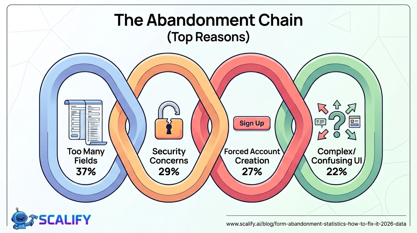
The top two reasons — too many fields (37%) and forced account creation (27%) — are both entirely within the control of the business deploying the form. No external constraint forces a form to have 14 fields or to require account creation before purchase. These are design and product decisions that are being made without sufficient awareness of their abandonment cost.
The 29% who cite security concerns is a particularly important finding because it points to a trust gap that can be addressed with explicit reassurance: privacy policy links, security badges, "we never sell your data" micro-copy, and SSL certificates all address this concern directly. A visitor who would have converted if they'd trusted the form with their email address is a conversion that was lost to a fixable confidence gap, not to genuine data risk.
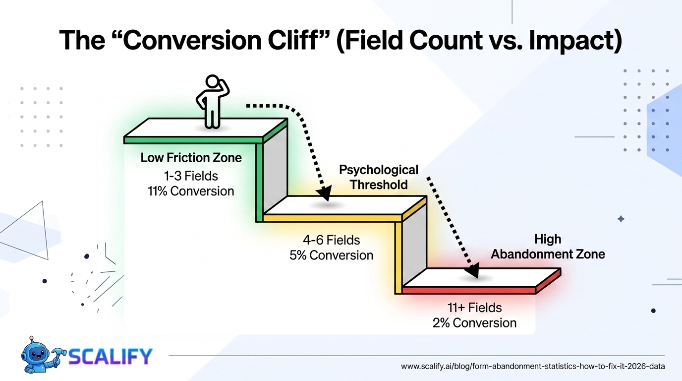
Field Count vs. Conversion Rate: The Core Data
Number of Form FieldsAverage Conversion RateRelative Performance1 field~11%Highest conversion (email capture pop-ups)2 fields~8%Strong — name + email3 fields~7%Good — still low friction4 fields~6%Acceptable, moderate friction5 fields~5%Noticeable friction beginning6 fields~4.5%Each additional field costs more7 – 10 fields~3.5 – 4%Significant drop11 – 15 fields~2 – 3%High abandonment zone16+ fields~1 – 2%Very high abandonment
The relationship between field count and conversion rate is not perfectly linear — there are inflection points where adding one more field causes a disproportionate abandonment increase. Research by Formisimo consistently finds that fields 5 and 6 in a form cause more abandonment than expected because they cross a psychological threshold where the form begins to feel like work rather than a quick interaction. This is why the jump from 4 fields to 8 fields can cost nearly half the conversion rate.
Mobile Form Abandonment: A Specific Crisis
Mobile Form IssueImpact on Completion RateNo autofill support-30% completionWrong input type (number vs text keyboard)-12% completionSmall touch targets for radio/checkbox-15% completionNo Apple Pay / Google Pay on checkout-25% checkout completion on iOS/AndroidKeyboard covers form fields-18% completionNon-responsive form layout-40% completion
Mobile form abandonment is 65% higher than desktop — a gap primarily driven by input friction. The same 10-field form that many desktop users will complete becomes nearly impossible to complete smoothly on a phone with a virtual keyboard. Every optimization for mobile form completion has outsized impact compared to the same optimization on desktop, because mobile visitors represent 64% of web traffic and face fundamentally more friction in form interactions.
The Apple Pay / Google Pay point deserves special emphasis for e-commerce. On iOS and Android respectively, these payment methods replace the entire credit card entry process (16-digit card number, expiration date, CVV, billing address) with a single biometric authentication (Face ID, Touch ID). This eliminates what the Baymard Institute identifies as the highest-friction portion of mobile checkout. Businesses that have implemented Apple Pay report 20–30% improvements in mobile checkout completion rates — one of the highest single-change ROI improvements available to mobile e-commerce.
Specific Form Fixes and Their Measured Impact
FixAvg Completion Rate ImprovementDifficultyRemove unnecessary fields+20 – 120% (depends on how many removed)LowAdd inline validation (real-time errors)+22%MediumAdd progress bar to multi-step form+28%Low-MediumBreak long form into multi-step+30 – 40%MediumAdd social login option+15 – 25% for registration formsMediumRemove phone number requirement+5 – 8%Low (policy decision)Enable autocomplete attribute+30%Low (single HTML attribute)Add security badge / trust statement+8 – 15%LowGuest checkout option (e-commerce)+25 – 45% checkout completionMediumApple Pay / Google Pay (mobile)+20 – 30% mobile checkoutMediumUse correct input types (mobile keyboards)+10 – 15% mobileLow
The Inline Validation Finding in Detail
Inline validation — showing error messages as the user fills out each field, rather than displaying all errors after submission — reduces form abandonment by 22% on average. The psychological mechanism is significant: submitting a complete form only to receive a page full of red error messages is deeply frustrating. It requires the user to re-read the entire form, find the errors, and re-engage with something they thought was complete.
Inline validation breaks this frustration by providing feedback at the moment each field is completed. "Please enter a valid email address" appearing when focus leaves the email field is a tiny friction event that prevents a massive frustration event at submission. The user corrects one field at a time with zero re-engagement cost — compared to the multi-error review that causes 22% of users to give up entirely.
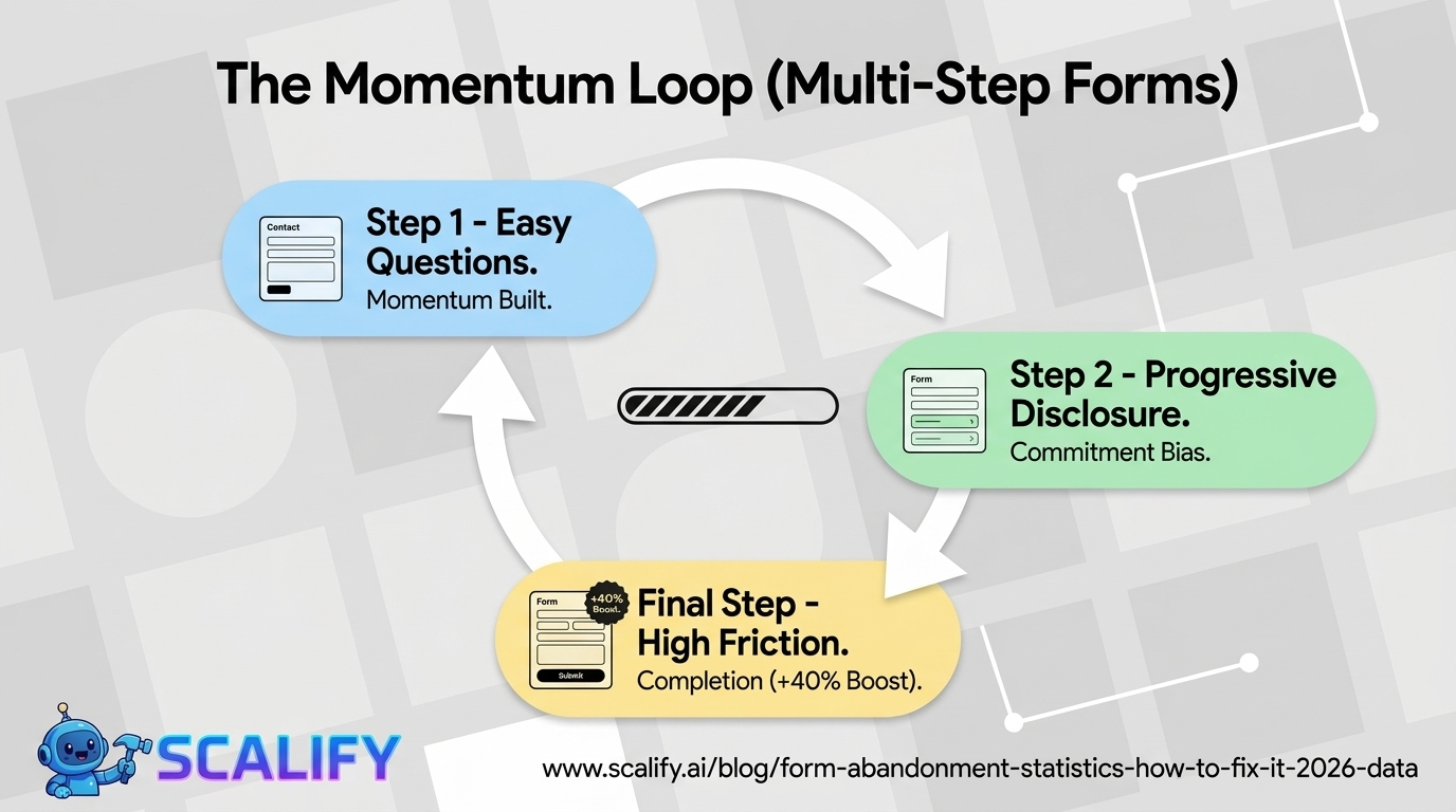
The Multi-Step Form Effect
Converting a long single-page form into a multi-step form — presenting 3–4 questions per step rather than all questions at once — consistently improves completion rates by 30–40%. The mechanism is psychological momentum: completing step 1 of 3 creates commitment bias, making abandonment feel like giving up progress rather than simply not filling out a form. The Ikea Effect (valuing things more when you've invested effort in them) works in the form's favor for each completed step.
Multi-step forms also allow strategic question ordering — asking for low-friction information first (name, basic preferences) before higher-friction information (phone number, budget, payment details). By the time the form reaches higher-friction fields, the visitor has already invested enough effort that abandonment feels more costly.
The "Phone Number Required" Tax
The specific finding that requiring a phone number increases abandonment by approximately 5% deserves attention because it's so actionable. Most businesses include phone number in contact forms and lead generation forms by default — without having verified that they actually need it at the capture stage. A lead that enters name + email without a phone number is still a lead that can be nurtured to the point where they voluntarily provide a phone number for a consultation call. The conversion from lead to customer matters more than whether the initial form captured a phone number.
For businesses where phone number is genuinely needed for follow-up (home services quoting, complex B2B sales), making it optional rather than required ("optional — for faster response") typically recovers a meaningful portion of the abandonment while still collecting phone numbers from the visitors who want to be called.
Form Analytics: Knowing Where People Drop Off
Most businesses know their overall form conversion rate but don't know which specific fields are causing abandonment. Form analytics tools (Hotjar's form analytics, Formisimo, FullStory) show field-by-field completion rates, enabling precise identification of which fields are causing disproportionate abandonment. Common findings:
The CAPTCHA finding is particularly striking: traditional CAPTCHAs (those distorted text challenges or "select all images with traffic lights" problems) increase abandonment by 12–15% while blocking only 5% of actual bot traffic. Google's reCAPTCHA v3 (invisible, no user interaction required) provides equivalent spam protection without the user-experience tax.
The Bottom Line
Form abandonment at 68% average represents one of the largest recoverable conversion losses available to most websites. The fixes are primarily not technical — they're product and policy decisions: removing unnecessary fields, offering guest checkout, making phone numbers optional, breaking long forms into multi-step flows, and implementing inline validation. The measurable ROI of these changes is exceptional: removing 7 unnecessary fields (11 → 4) can increase conversion by 120%. Adding Apple Pay to mobile checkout can recover 25% of mobile abandonment. These are among the most high-impact, low-cost conversion improvements available to any e-commerce or lead generation website.
At Scalify, we build websites with form conversion as a first-class design consideration — right number of fields, proper mobile optimization, inline validation, and the trust signals that address the security concerns causing 29% of form abandonment.
Top 5 Sources
Key Takeaways and Next Steps
The principles and data in this guide reflect what actually works in professional web development and digital marketing in 2026 — not theoretical best practices but measured, documented outcomes from implementations at scale. The gap between knowing these principles and benefiting from them is always execution: the businesses that act on what they read, implement changes systematically, and measure the results consistently outperform those who consume information without converting it to action.
For any improvement described in this guide, the implementation sequence that produces the best outcomes: assess your current situation against the benchmarks provided, identify the 2–3 highest-impact improvements specific to your situation, implement them with measurement tracking in place, evaluate results after 30–60 days, and plan the next iteration based on what you learned. This cycle — assess, prioritize, implement, measure, iterate — is the operational foundation of continuous improvement that compounds into significant competitive advantage over the 12–24 month horizon.
The compounding returns from consistent web presence investment are not linear: a website that improves slightly each month accumulates to dramatic improvements over a year, and those improvements multiply with each other. Faster load times improve both search rankings and conversion rates simultaneously. Better content attracts backlinks that improve rankings that attract more traffic. More testimonials build trust that improves conversion rates that improve revenue that funds more investment. The interconnected nature of website performance means that each improvement amplifies the value of every other improvement — making the decision to invest consistently, across multiple dimensions simultaneously, the highest-ROI approach to digital marketing available to most businesses.
At Scalify, every website we build reflects these principles — technically optimized, conversion-focused, SEO-ready, and designed to compound in value over time as content, backlinks, and organic authority accumulate on the strong foundation we deliver in 10 business days.


.jpeg)

.jpeg)


78 SW 7th St, Miami, FL 33130


